
BulletX
Student Project
Tools
Figma
BulletX Travel App & Seat Infotainment Screen
Duration
Semester Project
Overview
A school project in UX/UI design, BulletX enhances bullet train travel with a seamless mobile-to-seat-screen experience. It features an intuitive booking system, interactive seat selection, and a QR code for hassle-free check-ins. With a sleek, dark-themed interface, BulletX prioritizes convenience, making train travel in Japan smoother and more efficient.
The Problem
Traveling in Japan can be overwhelming, especially for visitors unfamiliar with the language or train system. In regions where English isn’t widely spoken, booking tickets and navigating stations can cause anxiety. Traditional train travel also lacks personalization, making the journey feel disconnected.

Goals and Objectives
Onboarding
Traveling in Japan can be overwhelming, especially for visitors unfamiliar with the language or train system. In regions where English isn’t widely spoken, booking tickets and navigating stations can cause unnecessary stress and anxiety. Traditional train travel also lacks a personalized, engaging experience, often making the journey feel disconnected.
My goal was to design a solution that makes bullet train travel in Japan easier, more intuitive, and enjoyable for both locals and international travelers. I wanted the experience to feel seamless.
Success would look like:
✔️ A user-friendly interface that reduces confusion
✔️ Stress-free booking and boarding processes
✔️ Real-time, personalized travel information
✔️ An overall smoother, more enjoyable journey
Research


This project taught me a powerful lesson: authentic experience fuels meaningful design. Having navigated Japan’s train system as an anxious traveler myself—fumbling with ticket machines, missing departures, and wishing for clarity—I channeled those frustrations into every decision. The app became more than a concept; it was a solution I needed as a user.
I also embraced the iterative nature of design. No screen is ever "finished," and no app is beyond improvement. With each prototype, I discovered new ways to reduce friction—whether simplifying QR check-in or refining the AR infotainment gestures. Progress happens one screen at a time, and that’s the thrill of the process.
STRV UI Apple Watch >
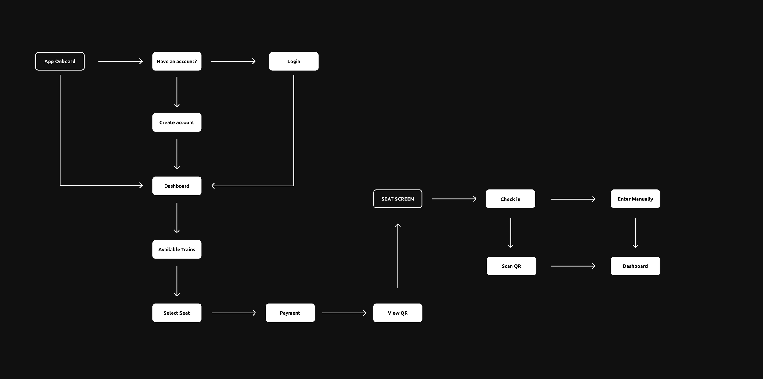
Booking trains in Japan can feel overwhelming—especially when faced with foreign ticket machines and complex schedules. This feature transforms the process by letting travelers effortlessly secure tickets with flexible departure times, transparent pricing, and XPoints rewards—turning what was once a stressful task into a seamless part of the journey.
Seamlessly Book a Trip
Booking trains in Japan can feel overwhelming—especially when faced with foreign ticket machines and complex schedules. This feature transforms the process by letting travelers effortlessly secure tickets with flexible departure times, transparent pricing, and XPoints rewards—turning what was once a stressful task into a seamless part of the journey.


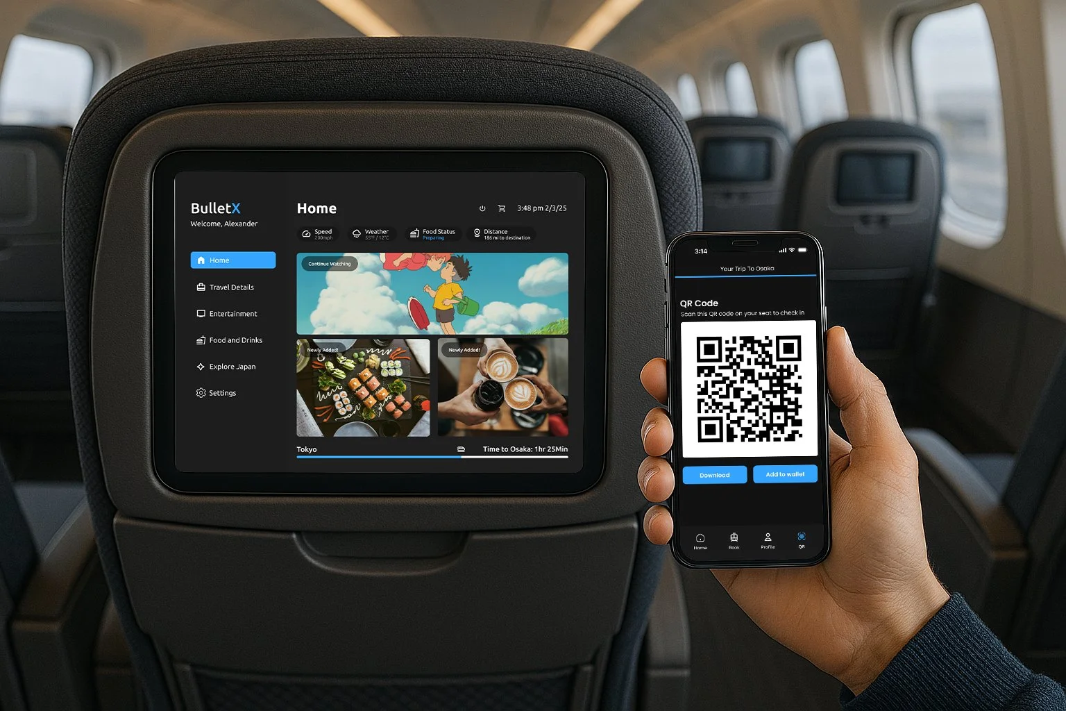
Infotainment Screen
Long train rides can feel impersonal—especially when navigating unfamiliar systems. The Infotainment Screen reimagines the journey with seamless seat check-in (just scan your phone’s QR code), curated entertainment, and location-based AR guides that bring passing landscapes to life. Order meals to your seat, play games, or watch films—all tailored to your preferences. This isn’t just travel; it’s your journey, made effortless.
What did I learn?
Key Insights from Usability Testing:
Visual hierarchy and clarity needed improvement. Users often struggled with knowing which elements were interactive
Booking flow was confusing. Several users found the “Search Train” option under the booking tab to be confusing
Design feedback included comments that colors appeared “too flat” in some places, and the ticket visuals lacked contrast, making important information harder to read.
Home screen and navigation confusion. Users found the home screen imagery unclear and had difficulty understanding what certain visuals were meant to communicate. For example, the “Explore Japan” tab left users unsure where to click next.
Missing contextual information. Users expressed a desire to see remaining travel time consistently across different screens.
Visualizing the Solution
To better understand user pain points and opportunities, I conducted usability testing on the initial mobile app prototype with a small group of users. Through observation and feedback, several recurring themes emerged:
